

I'm sure you've come across a website or an application with a design that's different from what you're used to but catches your attention. I imagined the website design colours were bold, the shapes were clean and simple, and everything seemed to be in the right place. That's precisely what happened to me the first time I saw a neubrutalist-inspired design. I was immediately captivated by its minimalist approach, the use of basic shapes, and the striking pop of colours. However, it wasn't until later that I discovered that this style of design had a name called Neubrutalism. And as I delved deeper into this design philosophy, I realized that it had a significant impact on the world of UI design. Its focus on functionality, honesty, and simplicity has influenced the creation of many modern websites and digital interfaces, making them more intuitive and user-friendly.
The Implementation of Neubrutalism Design Principles in A Fashion Website
I designed a fashion website with a few bold colour palettes to create a clean, minimalist aesthetic. Implementing a few colour palette reinforces the minimalistic design while allowing for clear visual cues to visualize elements on the website, making it easy to navigate and use.
To incorporate Neubrutalism principles, the design elements on the website are straightforward and may come across as slightly unappealing due to the use of bold colours because I tend to avoid bright and contrasting colours. The typography used is clean and easy to read, and it supports the modern aesthetic of Neubrutalism. However, I used Arial and Inria Sans, as these are sans-serif fonts, which do fit the Neubrutalist aesthetic. Also, the layout is simple and uncluttered, with an emphasis on usability and functionality.

Let's Start Over
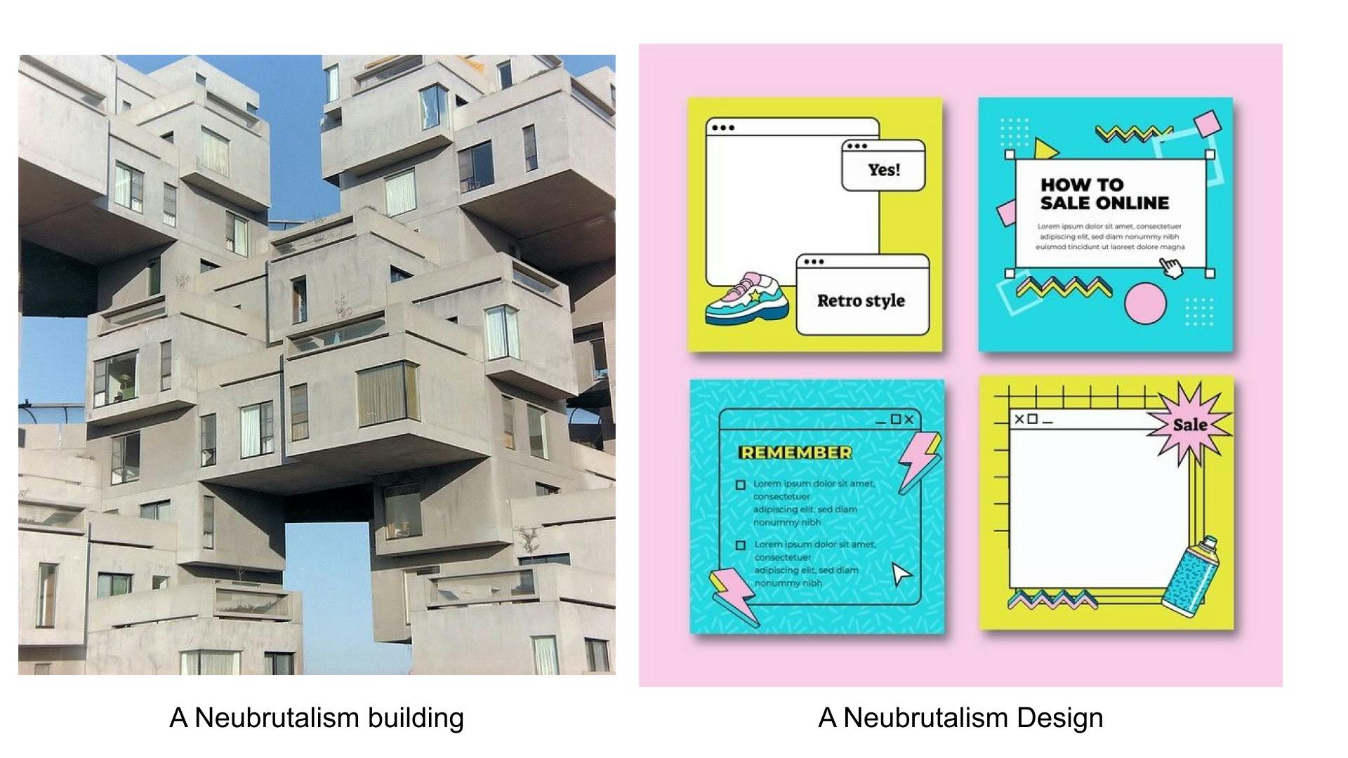
Are you confused about what Neubrutalism is and would like to know more? Neubrutalism is a style of architecture that gained popularity in the 1960s. The term comes from the French word "béton brut," which means "raw concrete.". The movement was a reaction against the elaborate and decorative architecture of the past, instead focusing on simple and practical designs. Neubrutalist design principles often involve simple shapes, clean lines, and a grid system to create a sense of order and balance.
Neubrutalism Vs brutalism
Neubrutalism and Brutalism share a lot of similarities. However, there are a few key differences that set them apart.
Brutalism is an architectural style that emerged in the 1950s and 1960s and was characterized by its use of raw, unfinished materials such as concrete and steel. Brutalist buildings were often imposing and fortress-like in appearance, with large, monolithic forms that emphasized their functional purpose over aesthetics.
Neubrutalism, on the other hand, emerged in the late 1960s and early 1970s as a refinement of Brutalism. While still using raw and honest materials, Neubrutalist buildings were more refined and minimalist in appearance, with cleaner lines and simpler shapes.
In essence, Neubrutalism is an updated version of Brutalism, that takes the same principles of functionality and raw materials and applies them in a more refined and nuanced way.

Some of the key principles of Neubrutalism that can be applied to UI design
Functionality Over Aesthetics: Neubrutalism emphasizes the importance of functionality over aesthetics. In UI design, this means prioritizing user experience and usability over visual appeal.
Minimalism: Neubrutalism's minimalist approach can be applied to UI design by using clean and simple design elements, with a focus on functionality rather than aesthetics elements.
Grid Systems: Neubrutalist architecture often uses grid systems to create a sense of order and balance. This principle can be applied to UI design by using grids and layout systems to create a visually cohesive and structured design.
Modern typography: This means using fonts that are clean, simple, and easy to read. Neubrutalist typography often features sans-serif fonts, such as Helvetica or Arial, with a focus on simplicity and legibility. Neubrutalism emphasizes the significance of readable and clear typography. In UI design, this principle can be applied to avoid cluttered or confusing design elements.
Colourful Contrasts: Neubrutalism often incorporates clashing colours in its designs as a way to create striking visual contrasts and draw the viewer's attention. This approach emphasizes the design's functional aspects while adding a playful and dynamic element to the overall aesthetic. Clashing colours in neubrutalist designs can also help to create a sense of depth and dimensionality, making the interface or website more visually engaging. However, it's important to use contrasting colours strategically and with care, as too much contrast can be overwhelming and distract from the user experience.
Examples of Websites that illustrate the application of Neubrutalism
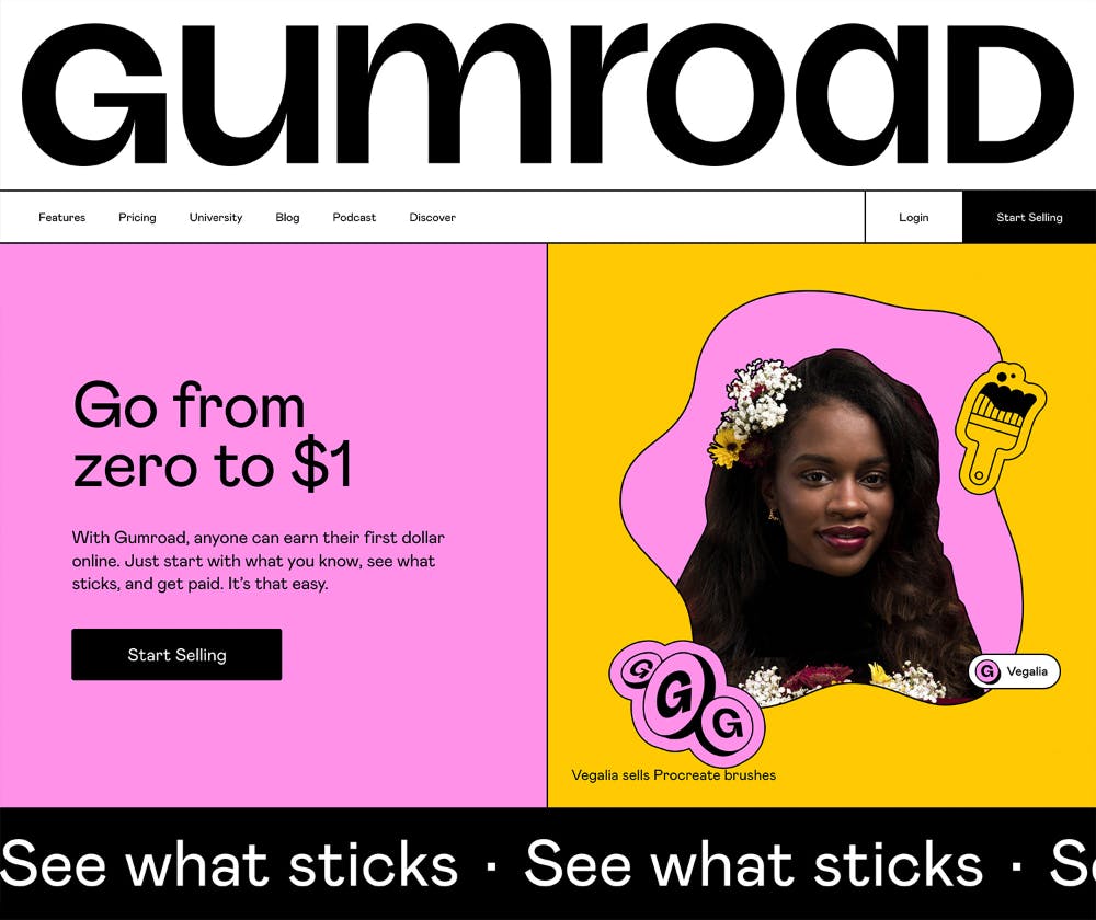
Gumroad: Gumroad's interface features a minimalist layout with a focus on functionality over aesthetics, utilizing simple geometric shapes and bold colour contrasts. The platform's design is stripped down to the essentials, making it easy for users to navigate and complete transactions.
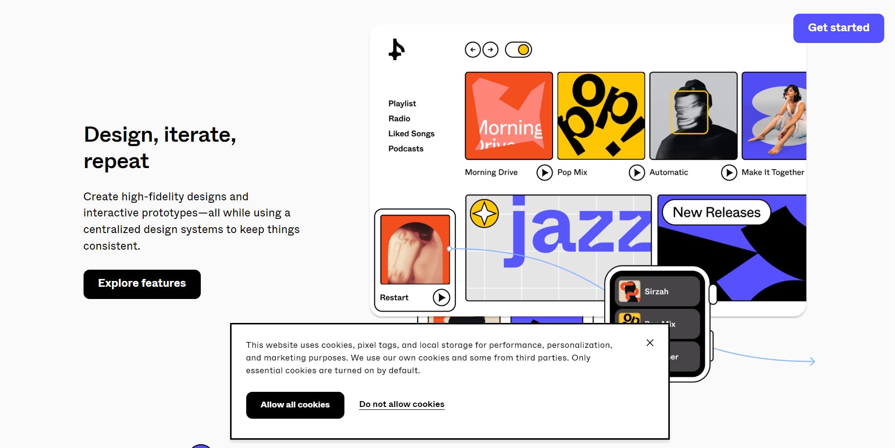
Figma: Figma's design features a clean, straightforward layout that prioritizes functionality and usability over flashy visual elements. Figma's interface utilizes simple geometric shapes, sharp angles, and bold colour contrasts to create a sleek and modern aesthetic that is both visually engaging and user-friendly.
Groupe Castor and Pollux: The minimalistic feel of the website emphasizes the essence of Neubrutalism, which is characterized by the use of animation and expressive forms. Additionally, the use of animation in the design is typically aimed at enhancing the user experience and guiding the user's attention to specific elements of the website.

Conclusion
At first, I was hesitant about exploring this aspect of design due to its highly contrasting colours. However, I became curious about how these principles could be applied to UI design, so I did some research. Through this process, I have come to realize that Neubrutalism has immense potential to serve as a compelling contrast to current design trends. I believe this is just the beginning of a new design direction, and I am excited to see how other companies and brands will develop it further. With its continued influence on design trends, Neubrutalism is likely to remain relevant in the design world for years to come.